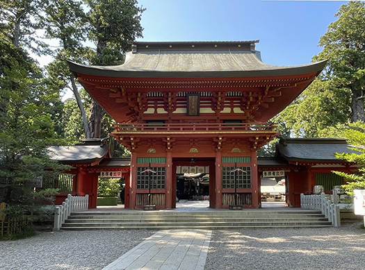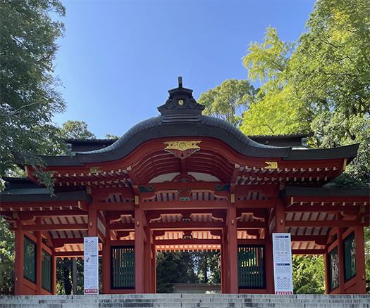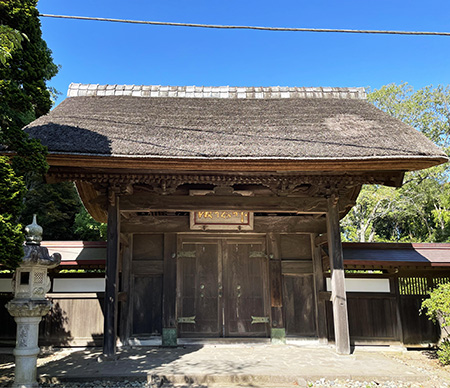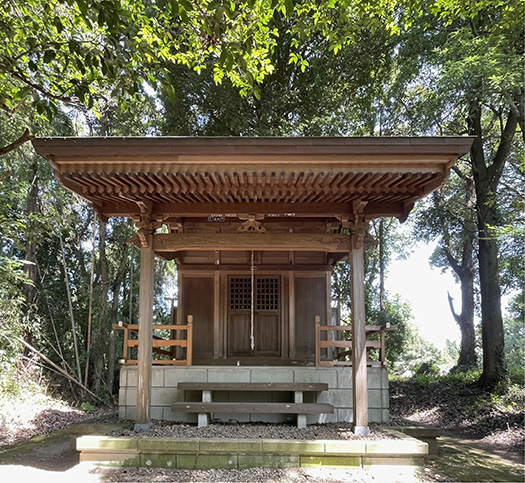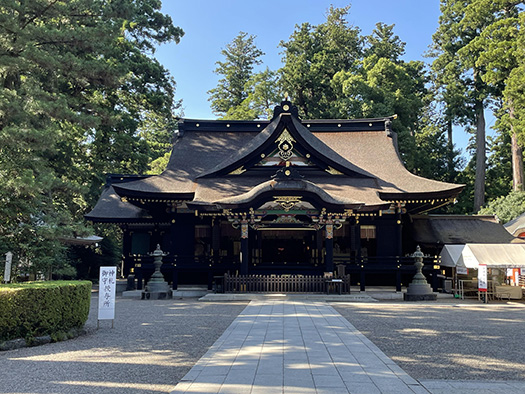
楼門を抜けると、香取神宮の拝殿がまっすぐ参詣者の眼前に現れる。三角形の破風と、さらにその下にはまろやかなカーブを見せる唐破風がわたしたちを引き寄せてくれる。香取神宮の前に鹿島神宮を参拝しているわたしからすると、鹿島神宮の古格な「奥宮」の簡素な深遠さとは異質なデザイン感覚。
いかにも江戸期(元禄13)1700年建築という時代相がそのまま表れたような空気感に包まれる。どうしてこのような表現が隆盛したか、神さまには申し訳ないが自分的にはちょっと違和感が募ってくる。
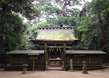
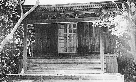
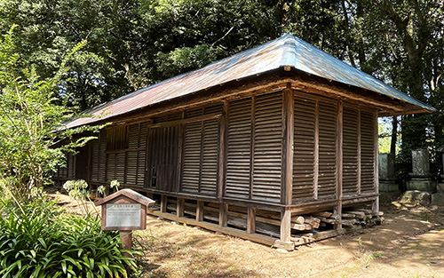
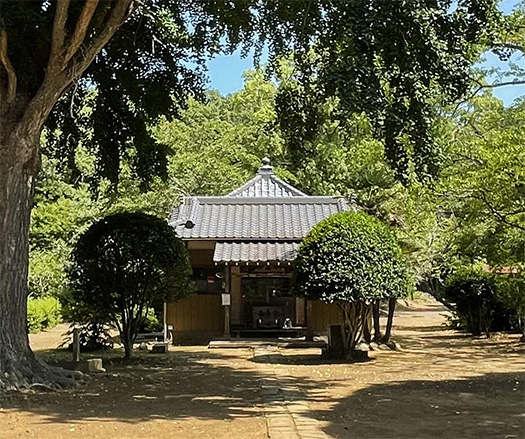
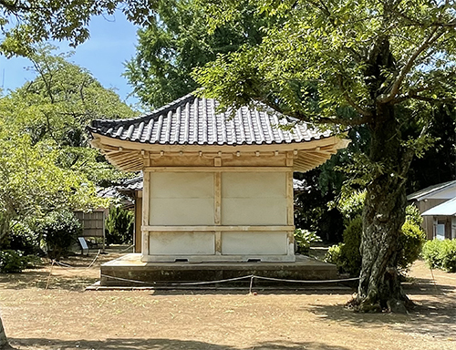
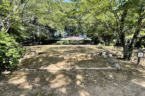
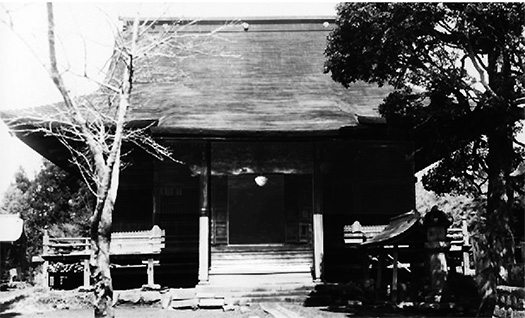
これが2−3年前に建て替えられる前の鹿島神宮・奥宮。コケのエッジもいかにもゆかしさを強調している。ちなみにこれは家康時代に寄進された建築。
一方の上の写真の香取神宮拝殿・本殿は5代徳川将軍が寄進した建築なので、幕府の「威光を示す」的な表現意図から、いかにも江戸期文化爛熟期の感覚が投影されたものなのでしょう。この香取にも奥宮はあってあとで紹介しますが、それはそれでいい(笑)のですが・・・。
多様な感受性を通史的に体験できる現代日本人としては、こちらの鹿島・奥宮の方がデザイン表現としては親和性を感じる。しかし徳川初期とは、たぶん参詣者の数もうなぎ上りになってそれなりの拝殿として巨大さが求められコケ脅かし的な要素も必要になったのか。江戸期の一般大衆への訴求として、奥宮の時代とは人心も変化した時代には、こういう表現が求められたのでしょう。
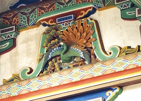
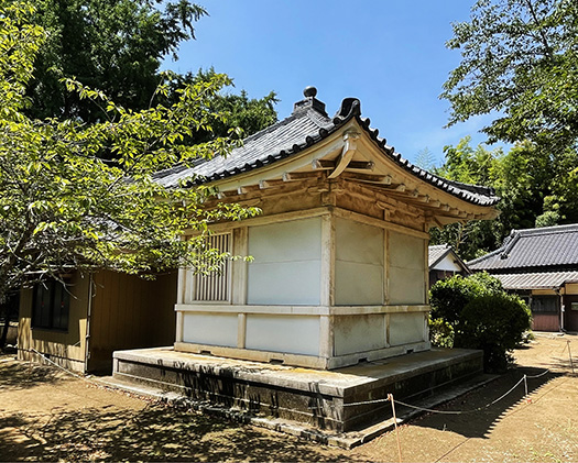
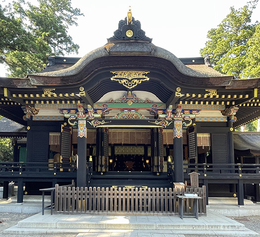
こちらの写真は「本殿」建築の「蟇股〜かえるまた」のキッチュデザイン。こういった木造建築の構造補強材には日本的なデザイン感覚集積の推移がある。
蟇股は仏教伝来のとき、寺院建築の建築様式として入ってきたもので屋根荷重を受ける補強材。建築構造上必要部材の一つでしたが、やがて日本人好みで装飾化。もちろん中国や韓国の寺院建築にもある部材ながら、ここまで装飾化していくのは日本独自の発展とされる。以下に時代変化ぶり。
奈良時代:とにかく分厚くがっちり
平安時代:ちょっと飾り的な要素が出てくる
鎌倉時代:透かし彫りなどの加工がされる
室町・安土桃山:彫りと曲線が特徴
江戸時代前期:きらびやかな彩色と彫刻
江戸時代後期:彫刻技術が飛び抜ける
現在:どれも曖昧・融合・良いとこ取り
どうも時代を経る毎にゴテゴテになっていくのは、日本人大衆の気分の趨勢を表すのだろうか?
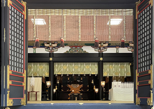
しかし日本建築にはこういった日本人の精神性の推移というものが証言者のように表現されている。それはコトバによる表現とか,観念とかではなく、より直接的な感受性をわたしたちに伝えてくる。木造の匠たち、建築表現者たちは、その過程でデザインを構想し、そのための装飾要素の美的鍛錬も繰り返し継続してきたということ。
現代人としては、謹んで拝させていただく次第。
English version⬇
Katori Jingu Shrine, a kitschy Genroku-style building (4)
The world has changed since the early Edo period, and perhaps the building was intended to show the prestige of the shogunate. The building’s inclination toward showiness is astonishing. The building’s design is a bit of an eccentricity.
After passing through the gate, the worship hall of the Katori Jingu Shrine appears straight before the eyes of visitors. The triangular gable and the gently curving karahafu (Chinese gable) below it draw us in. As someone who has visited Kashima Jingu Shrine before Katori Jingu Shrine, I find the simplicity and profundity of the ancient “Okumiya” of Kashima Jingu Shrine to be quite different from the sense of design.
It is wrapped in an air of being built in 1700 during the Edo period (13th year of the Genroku era), as if it were a direct expression of its historical phase. I am sorry to say that I feel a little uncomfortable about why this kind of expression has flourished.
This is the Kashima Jingu Shrine Okumiya before it was rebuilt 2-3 years ago. The moss edges also emphasize its yukashisa (gracefulness). Incidentally, this is a building donated during the Ieyasu era.
On the other hand, the Katori Jingu worship and main shrines in the photo above were donated by the 5th Tokugawa Shogun, so the intention of the Shogunate was to “show its prestige,” which is a projection of the sense of the full maturity of Edo period culture. There is also an inner shrine in Katori, which I will introduce later, but that is fine (laughs)….
As a modern Japanese who can experience diverse sensitivities in a diachronic manner, I feel more affinity with this Kashima Okumiya as a design expression. However, in the early Tokugawa period, the number of visitors to the shrine was probably on the rise, and the shrine was required to be large enough to scare people away with its mossy appearance. This kind of expression was probably required to appeal to the general public in the Edo period, when people’s minds had changed from the time of the Okumiya shrine.
This photo shows the kitsch design of the “toadstools (kaerumata)” of the “main shrine” building. This kind of structural reinforcement material for wooden buildings has a transition of Japanese design sense accumulation.
Toadstools were introduced as an architectural style for temple buildings when Buddhism was introduced to Japan, and were used as reinforcements to take the load of the roof. It was one of the necessary structural members of a building, but it eventually became a decorative element for Japanese taste. While toadstools are of course also found in Chinese and Korean temple architecture, the development of toadstools to this extent is said to be a uniquely Japanese development. The following is a brief description of the changes over time.
Nara Period: Thick and solid
Heian period (794-1192): A little decorative element appears.
Kamakura period (1185-1333): Openworking and other decorative processes began to be used.
Muromachi and Azuchi-Momoyama Periods: Carvings and curves became a feature.
Early Edo period: Lavish coloring and carving
Late Edo period: Carving techniques jump out
Present: Vague, fusion, or a combination of the best of both worlds
Is it an indication of the trend of the Japanese public’s mood that the Japanese artwork has become more and more elaborate with each passing era?
Japanese architecture, however, is a witness to the transition of the Japanese mentality. It conveys to us a more direct sensitivity than verbal expressions or ideas. The wooden craftsmen and architectural expressionists conceived of the design process, and repeatedly trained the aesthetic of the decorative elements for it.
As a modern human being, I would like to respectfully acknowledge this.
Posted on 8月 23rd, 2023 by 三木 奎吾
Filed under: 住宅マーケティング, 日本社会・文化研究 | No Comments »


