

きのうつい「あをによし」という奈良の都の枕詞に触れましたが、
知人の読者の方から面白い反応もありました。
古代の建築、600年代初頭の法隆寺と750-770年代の韓国仏国寺の比較。
古代といっても150-160年の時代差があり法隆寺は創建時が維持されているのと
韓国仏国寺では数度にわたって再建されている違いはある。
あるけれど、再建時の再生努力を信じて創建時が再現されていると考えると
ある程度、この時代の「色彩感覚」がみえるのではと思えます。
わたしは建築を通して人間の歴史からホントを探ってみたい人間。
古代の人々が世界をどのように認識していたのか、
そういう部分の実相を考えるとき、色への感受性とは基本に近いと思います。
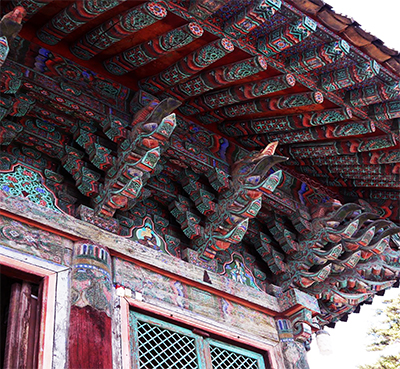
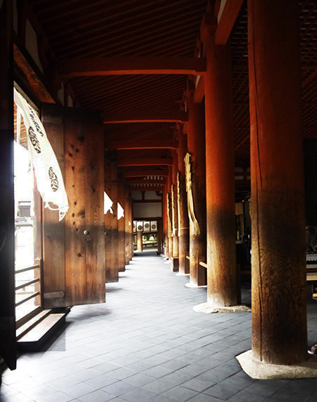
写真は上2点が韓国仏国寺でのもの。上は回廊部分で下はせり上げ部の組物。
まことにカラフルな色彩感覚に圧倒される思いがしてきます。
いろいろな色彩があるように見えるけれど基調色は
緑と赤だと認識できるでしょう。
で、仕上げられた年代を思えば日本では「奈良時代」に相当し、
それこそ「あをによし」と枕詞が万葉集に見られる色彩感覚を想起させられた。
奈良の大仏開眼会に朝鮮・新羅の王子たちの代表団が来日したとされるので、
かれらは当然奈良の都に滞在していたことだろう。
そういうときに「あをによし」という色彩の世界を体感したことも疑いがない。
帰国後、新羅の国の威信建築としての仏国寺建設が仕上がってきて
そこへの彩色の段階になって、採用された色彩感覚に
どうも日本を含めた国際的共通性があったように思えるのですね。
仏教は東アジア全域で「国際宗教」として尊崇を集めていたことだろうし、
建築の国家仏教寺院でのカラーマネジメントも存在したものと考えられます。
「あをによし」の色彩感覚はやはり東アジア共有の感覚だったのではないか。
あをは後代に明確化する三原色の青ではなく、やはり緑だったのでしょう。
いわゆる青は藍という植物性の顔料から発生してきたものであり、
「青は藍より出でて藍よりもなお青し」というコトバが伝えられている。
藍から藍染めに仕上げていく工程をテレビ記録番組でみたけれど、
大変な工程を経てようやく出来上がる色彩なので
たとえば奈良の都などのような建築工事に大量に使う塗料材料としては
当然、鉱物資源顔料が主体を占めていたのでしょう。
その色彩としては赤や緑が基本的な構成になったことは自然だと思える。
一方で法隆寺の色合いでは丹色・赤は認識可能だけれど
緑はそう多数派だとは思えない、というかほとんど見かけない。
「あを」は鉱物顔料として奈良の都周辺では採取されたが、法隆寺段階では
まだ鉱脈が発見できず、丹色顔料だけが使われたものかも知れない。
建築の意匠に於いてかなり決定的な要素である色合いについて
人間社会には技術の発展経緯が積み重なっているのだと証言してくれている。
English version⬇
[Ancient color sense Horyuji and Bulguksa-9]
Yesterday, I touched on the Makurakotoba of the capital of Nara called “Ayoyoshi”.
There was also an interesting reaction from an acquaintance reader.
Comparison of ancient architecture, Horyuji Temple in the early 600s and Korean Bulguksa Temple in the 750-770s.
Even though it is ancient, there is a time difference of 150-160 years, and Horyuji Temple is almost maintained at the time of its construction.
There is a difference that the Korean Bulguksa Temple has been rebuilt several times.
However, if you believe in the rehabilitation efforts at the time of reconstruction and think that the time of construction is almost reproduced.
To some extent, I think you can see the “color sense” of this era.
I am a person who really wants to explore human history through architecture.
How ancient people perceived the world
When considering the reality of such a part, I think that sensitivity to color is close to the basics.
The top two photos are from Bulguksa Temple in Korea. The upper part is the corridor part, and the lower part is the braided part.
I feel overwhelmed by the colorful sense of color.
It looks like there are various colors, but the basic color is
You can recognize it as green and red.
So, considering the finished age, it corresponds to the “Nara period” in Japan,
That is what reminded me of the sense of color that can be seen in the Manyoshu.
It is said that a delegation of the princes of Korea and Silla came to Japan at the Great Buddha Opening Party in Nara.
Of course, they would have stayed in the capital of Nara.
There is no doubt that I experienced the world of colors called “Ayoyoshi” at that time.
After returning to Japan, the construction of Bulguksa Temple as a prestigious building in Silla was completed.
At the stage of coloring there, the color sense adopted
It seems that there was international commonality including Japan.
Buddhism would have been revered as an “international religion” throughout East Asia,
It is probable that color management at the national Buddhist temple, which is the symbolic architecture, also existed.
I think the color sense of “Ayoyoshi” was a shared sense of East Asia.
It must have been green, not the three primary colors of blue, which will be clarified in later generations.
So-called blue originated from a vegetable pigment called indigo.
It is said that “blue is out of indigo and is still bluer than indigo”.
I saw the process of finishing from indigo to indigo dyeing on a TV recording program,
Because it is a color that is finally completed after a difficult process
For example, as a paint material used in large quantities for construction work such as the capital of Nara
Naturally, mineral resource pigments would have dominated.
It seems natural that red and green are the basic colors.
On the other hand, in the shade of Horyuji, you can recognize tan and red.
I don’t think green is so majority, or I rarely see it.
“Ao” was collected as a mineral pigment around the capital of Nara, but at the Horyuji stage
The veins have not been found yet, and it may be that only the vermilion pigment was used.
About color, which is a very decisive factor in architectural design
He testifies that the history of technological development is piled up in human society.
共有:

Posted on 9月 22nd, 2021 by 三木 奎吾
Filed under: 住宅マーケティング, 日本社会・文化研究, 海外住宅事情


コメントを投稿
「※誹謗中傷や、悪意のある書き込み、営利目的などのコメントを防ぐために、投稿された全てのコメントは一時的に保留されますのでご了承ください。」
You must be logged in to post a comment.