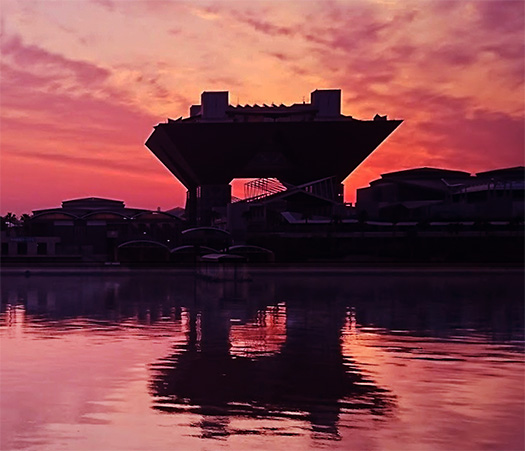
現代建築の中で、たぶんいちばん多くそこに行っているスポットと思えるのが「東京ビッグサイト」。いろいろな業界での全国イベントの会場として、北海道人としても参集することが多い。上の写真は、その東京ビッグサイトの夕景の瞬間を、日本建築伝統の「水面の映り込み」とのバランスを考えて捉えてみたもの。
言うまでもなく、人類やイキモノすべてはその生死の日々において天候が条件付けば、必ず夕陽を見続ける。その印象はイキモノの脳髄深く刻み込まれていく。その自然が生み出す夕景の色に、完膚なきまでに決定的な色彩感を抱くに違いない。たぶん歴世の画家たちも、その光景に息を呑んでいたに違いない。この惑星での最大のイキモノ共通心情かも。
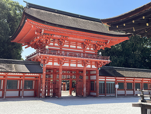
一方こちらは世界遺産に指定されている下鴨神社の「楼門」。
当然ながら、木造の重厚な木組みを魅せながら高層建築とするためにこのような造形になる。そしてその木組みに対して、このように「朱色」が彩色されるのが、宗教建築の約束事。このような配色の約束事にはいろいろな意味があるのだろうけれど、イチ参観者としては、前述のような自然現象からの基底的「刷り込み」を想起させられる。
朱色は、たぶんイキモノの脳にもっとも決定的な打撃力を持っているのだと思う。
共産主義も赤い旗を振るのには、ある原初的なアジテーション要素があるのだろう。怒りとか、攻撃性のような心情にはもっともふさわしい、それを「利用する」という基層心理。
宗教がそういったイキモノの精神作用を利用しない手はない。そのような意味合いが濃厚。以前2023.7.25にも【東京ビッグサイトと宗教建築デザイン】https://kochihen.replan.ne.jp/?p=41321 と題してブログを書いてみたけれど、それは「カタチ」のことだったと思う。
今回はその色彩について、同意できると思えるようになった次第。
自分では加齢とともにより「単純」なことにこころが向かってきている。多くの過去の人びとも同様だったのではないかと、いわば対話的な心情を持ってきております。
●お知らせ
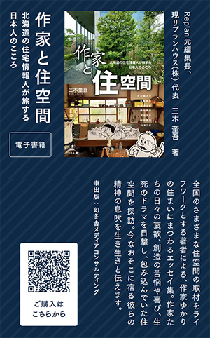
拙書「作家と住空間」幻冬舎から電子書籍で発刊
お求めはAmazonで。
https://amzn.asia/d/eUiv9yO
English version⬇
【Vermilion: Shimogamo Shrine’s Tower Gate and Tokyo Big Sight at Sunset】
Within Earth’s natural cycle, the sun’s journey is like a heartbeat, a breath. The rhythm it creates resonates in our sense of color. Overwhelmed by its power…
Among modern architecture, the spot I probably visit most often is Tokyo Big Sight. As a venue for national events across various industries, I frequently attend gatherings there as a Hokkaido resident. The photo above captures a moment of Tokyo Big Sight at sunset, balancing the traditional Japanese architectural concept of “reflections on water surfaces.”
Needless to say, all humans and living creatures, as long as the weather permits during their days of life and death, will inevitably keep watching the sunset. That impression is deeply engraved into the very marrow of living beings. They must feel an utterly decisive sense of color in the hues of that sunset created by nature. Probably, painters throughout the ages must have been breathless at that sight too. It might be the greatest shared sentiment among all living creatures on this planet.
On the other hand, this is the “Romon Gate” of Shimogamo Shrine, designated as a World Heritage Site.
Naturally, to achieve this form as a tall structure while showcasing the solid wooden framework, it takes on this shape. And for this wooden framework, painting it “vermilion” like this is a convention of religious architecture. While such color conventions likely hold various meanings, as a mere visitor, it evokes that fundamental “imprinting” from the natural phenomena mentioned earlier.
Vermilion, I suspect, possesses the most decisive impact on the brains of living creatures.
Communism, too, likely employs the waving of red flags for some primal agitational element. It taps into a foundational psychology that “exploits” this color as most fitting for emotions like anger or aggression.
Religion certainly wouldn’t pass up the chance to utilize such mental processes in living beings. That connotation is quite strong. I previously wrote a blog post titled [Tokyo Big Sight and Religious Architecture Design] https://kochihen.replan.ne.jp/?p=41321 on 2023.7.25, but I think that focused on the “form.”
This time, I’ve come to agree with the perspective on its color scheme.
Personally, as I age, my heart seems drawn more toward “simple” things. I feel a kind of dialogic connection, thinking many people in the past likely felt the same way.
●Notice
My book “Writers and Living Spaces” published as an e-book by Gentosha
Available on Amazon.
共有:

Posted on 9月 19th, 2025 by 三木 奎吾
Filed under: 未分類


コメントを投稿
「※誹謗中傷や、悪意のある書き込み、営利目的などのコメントを防ぐために、投稿された全てのコメントは一時的に保留されますのでご了承ください。」
You must be logged in to post a comment.