さて、次兄からもたらされた大量の資料をひととおりは目を通し終えられた。ふ〜やれやれ。
で、そこから直感的にいくつかの断片的な「事実」もしくは興味深い「昔人の記憶痕跡」が捉えられて、それを起点にして5代前や6代前の祖先の「息づかい」、一種生命感のようなものが湧き上がってきます。言ってみれば、そういった祖先からの「肉声」が残響してくるような感覚。
もうすでに世を去ってからはるかな時間を経過している先人から、なにかの涅槃的な「サイン」が示されるようです(笑)。やはり無上の充足感を味わえる。そしてその根拠を明確にして公知のものごとに昇華させていくことが、使命ということになっていくのでしょう。引き続き体重を掛けていきたい。
さてそういう作業に没頭させられているのですが、昨日のブログで触れた「輪島の漆器」に特徴的な「鶴」紋様について、知人の方から興味を示されたので本日はそのあたりを。
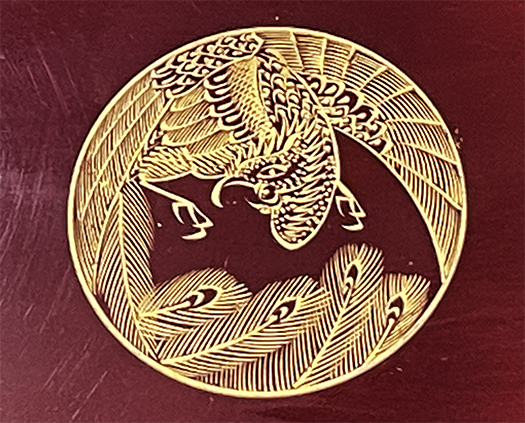
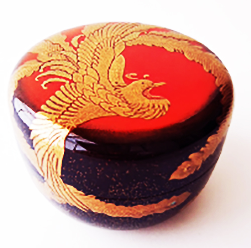
鳳山造という一種の「メーカー」印から情報を集めてみると、2番目の写真のような漆器の写真にめぐり会うことが出来た。こういうグッズの骨董品マーケットみたいなところで取引されているようです。まぁわたしは、情報が欲しいのと、絵画美術は「数寄」そのものなので、この鶴のデザイン表現について、興味を持った次第。
わが家の伝承された盆に描かれた鶴は、アタマが左下側に向いていて、一方の下の椀では右上方向に向けられている。また、盆の方では足の形状を丹念に描ききっているけれど、椀の方では描かれていないように見える。そういう違いはあるけれど、図案としては羽根が大きく円状に広げられて、それがデザイン表現上の大きな特徴。このふたつの画像だけなのだけれど、円の形状と羽根の広げ方にデザインコード性が感じられる。
まぁ、絵画や工芸には一般解的な共通言語は見出しにくいけれど、なにか「作法」のような部分でこの「流派」の定型手法があったようにも思える。こういったちょっとした気付きから入っていって、あるリアルにゴツンとぶつかる部分もある。さて、みなさんの印象はいかがでしょうかね?
お知らせ
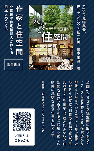
拙書「作家と住空間」幻冬舎から電子書籍で発刊
お求めはAmazonで。
https://amzn.asia/d/eUiv9yO
English version⬇
I want to analyze the design sensibility of crane patterns in the “Hōzan-style” tradition…
To delve deeply into objects left behind by our predecessors, it’s essential to uncover the subtle signs they left. Analyzing nirvana (lol)…
Well, I’ve finally finished skimming through the massive pile of documents my second brother brought over. Whew, what a relief.
And from that, intuitively, I grasped several fragmented “facts” or intriguing “traces of ancient memories.” Using those as a starting point, the “breath” of ancestors from five or six generations back—a kind of palpable sense of life—began to well up. It’s like hearing the lingering echoes of their actual voices.
It feels as if some kind of nirvanic “sign” is being shown to me by these ancestors who passed away so long ago (laugh). It truly brings an immense sense of fulfillment. And I suppose my mission is to clarify the basis for this and elevate it into something publicly known. I intend to keep pouring my weight into this work.
Now, while immersed in such work, an acquaintance expressed interest in the distinctive “crane” motif characteristic of “Wajima lacquerware,” mentioned in yesterday’s blog. So today, I’ll cover that.
Gathering information from the “maker’s mark” known as Hozan-zukuri, I came across photos of lacquerware like the one in the second image. It seems these items are traded in antique markets for such goods. Well, I wanted more information, and since painting and art are all about “suki” (a refined aesthetic sensibility), I became interested in the design expression of this crane.
The crane painted on the tray passed down in my family has its head facing down and to the left, while on the bowl below, it faces up and to the right. Also, on the tray, the leg shape is meticulously rendered, but on the bowl, it appears not to be depicted. Despite these differences, the design features large, circularly spread wings as a major stylistic characteristic. Though I only have these two images, I sense a design code in the circular shape and the way the wings are spread.
Well, while it’s hard to pinpoint a universal common language in painting or crafts, it seems this “school” had established techniques in some sort of “methodology.” Starting with these small observations, you sometimes hit a real, hard-hitting aspect. So, what are your impressions?
Notice
My book “Artists and Living Spaces” published as an e-book by Gentosha
Available on Amazon.
共有:

Posted on 11月 15th, 2025 by 三木 奎吾
Filed under: 未分類


コメントを投稿
「※誹謗中傷や、悪意のある書き込み、営利目的などのコメントを防ぐために、投稿された全てのコメントは一時的に保留されますのでご了承ください。」
You must be logged in to post a comment.