


旭川でのアース21例会住宅見学最後は(株)高組ホームファクトリー。
市内のモデルハウスの様子であります。
公共などの大型建築工事主体で、最近アース21に加入された会社。
わたし自身ははじめてその住宅を見学させて頂いた。
外観的にはシンプルな建物だったのですが、玄関の様子を見て明確に
間取りに45度の軸線傾斜をつけ室内空間を変化させる意図が感じられた。
わが家の設計時に、設計者・高村氏から四角四面のブロック住宅に
変化を生み出す仕掛けとしてこの45度の軸線傾斜を見せられた。
この空間配置計画では面白い空間の開放感が生まれる。
面積以上の「広がり感」が得られる効果がある。
実際に自分で空間を使ってみると、それは実感できたのです。
「視線の抜け」という建築が求める視覚効果に有効。
居間空間などでこのことは強く実感させられた。
ただし一方で局所的に「ムリの集中」みたいな場所ができやすい。
たぶん建築的興味としてはそれをどうクリアできるか、でしょう。
メリットとデメリットを覚悟の上でどう空間構成するか
個人的体験からの興味に導かれて見学させて頂いた。
エントランス部分の効果としては、ドア面がセットバックすることで
奥行き感を演出させる効果があることはすぐに見て取れる。
いわば外部ホールのようなウエルカム空間に活用している。
同様に2階でもここは「バルコニー」用途になっていて有益的。
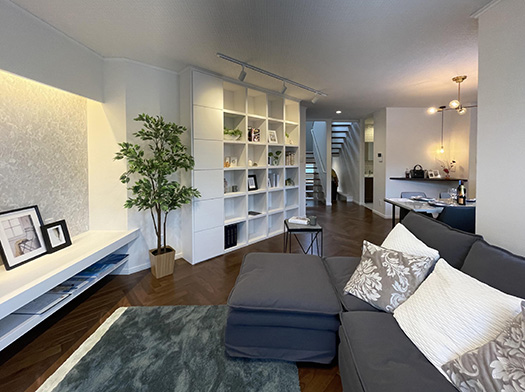
そして内部空間に入って見ると、やはりその効果は居間の本棚に見て取れた。
玄関の背面は居間への導入空間だけれど、そこに本棚が据えられて
空間の機能性として、インテリア装置としてみごとに活用。
DX時代だけれど紙の本は美観的に奥行きあるインテリアとして最高(笑)。
リビングから見るとダイニングや2階への階段などに
視界が十分に広がっていく感覚が得られて、面積以上に広さを感じられる。
プラン的には間取り図上では右側がリビングやキッチン。
いわばパブリックゾーンであり、広がりを享受するべき空間。
一方で左側は階段やトイレ・水回りなどの機能性空間であり、
その「開放感」を受け止める機能性の役割を担っていた。
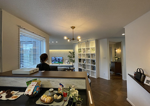

面白い空間展開を見せてくれているけれど、個人的には
ダイニングにすこしもうひと工夫が欲しいのではと思っていた。
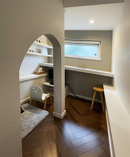
こういった変化に富んだ内部空間に点景として実現していたのが
階段下に設けられた遊び的空間。
子どものための「デスク空間」とでもいえるだろうか。
そういえばテレワークを意識してか、台所水回りに隣接したデスクもある。
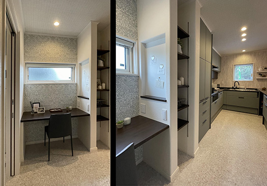
パブリック空間の情緒的な「やすらぎ感」と個室的な閉鎖性の確保。
現代住宅に求めているユーザー心理をどう取り込むか、
新たに住宅市場参入拡大を試みる企業としての挑戦マインドを感じた。
English version⬇
Asahikawa 2022: A 45-degree axial sloping floor plan.
A mechanism to create change in space. The merits of free openness in the floor plan and the struggle against the concentration of a sense of unreasonableness. The design struggle was observed with great interest. The house is a very interesting design.
The last of the Earth 21 meeting house tours in Asahikawa was at the Takagumi Home Factory Co.
This is a view of a model house in the city.
The company is mainly involved in large-scale construction work for public buildings and has recently joined Earth 21.
This was the first time for me to visit the house.
Externally, it was a simple building, but when I looked at the entrance, it was clear that it had a 45-degree axial tilt to the floor plan.
I could sense the intention to change the interior space with a 45-degree axial slope in the floor plan.
During the design of our house, the designer, Mr. Takamura, told us that he wanted to create a change in the square block house.
The 45-degree axial tilt was shown to me by the designer, Mr. Takamura, during the design of my house as a mechanism for creating change in a square block house.
This spatial arrangement plan creates an interesting sense of openness.
The effect is to create a “sense of spaciousness” that is greater than the area of the house.
When I actually used the space myself, I could feel it.
It is effective for the visual effect that architecture seeks, which is “line-of-sight”.
This was strongly felt in the living room space, for example.
On the other hand, however, it is easy to create places that are locally “concentrated”.
Perhaps the architectural interest is how to overcome this problem.
How to compose the space with the merits and demerits in mind?
I was led to visit the site by my interest based on personal experience.
The effect of the entrance area is that the door surface is set back to create a sense of depth.
It is immediately apparent that the setback of the door surface has the effect of creating a sense of depth.
It is utilized as a welcome space like an external hall, so to speak.
Similarly, the second floor is used as a “balcony,” which is also beneficial.
When entering the interior space, the effect can be seen in the bookshelf in the living room.
The back of the entrance is an introductory space to the living room, and the bookshelf is placed there.
The bookshelf is used as an interior decoration device as well as a functional element of the space.
Even in the age of DX, paper books are aesthetically pleasing as an interior design with depth (laughs).
When viewed from the living room, the view extends to the dining room and the staircase to the second floor.
The view from the living room gives the sensation of a fully expanded field of vision, giving a sense of space that is larger than the area of the house.
In terms of the plan, the living room and kitchen are on the right side of the floor plan.
These are the public zone, so to speak, and the space where one should enjoy the expansiveness of the space.
On the other hand, the left side is the functional space such as the staircase, toilet, and water supply.
functionality that receives the “openness” of the space.
The space is interesting, but I personally thought that the dining room could use a little more work.
I personally thought that the dining room could have used a little more work.
In this varied interior space, a playful space under the staircase was realized as a dotted landscape.
The playful space under the staircase.
It could be called a “desk space” for children.
Perhaps with teleworkers in mind, there is also a desk adjacent to the kitchen sink.
The emotional “sense of ease” of public space and the private, closed-off feeling of a private room.
How can we capture the user’s mentality that they are looking for in a modern house?
I felt the challenging mindset of a company newly attempting to expand its entry into the housing market.
共有:

Posted on 9月 12th, 2022 by 三木 奎吾
Filed under: 住宅マーケティング, 住宅取材&ウラ話


コメントを投稿
「※誹謗中傷や、悪意のある書き込み、営利目的などのコメントを防ぐために、投稿された全てのコメントは一時的に保留されますのでご了承ください。」
You must be logged in to post a comment.